

Joomla is an open source content management system (CMS) built on MVC web framework using PHP and MySQL/MS SQL/PostgreSQL. This allowed the developers to try their hands on the platform in creating new third-party add-ons and plugins. Taking another leap into the power of open source platform, enthusiastic developers have developed various fantastic page builders for Joomla.
We will be looking into some of those excellent plugins and page builders for Joomla that come handy in the time of necessity.
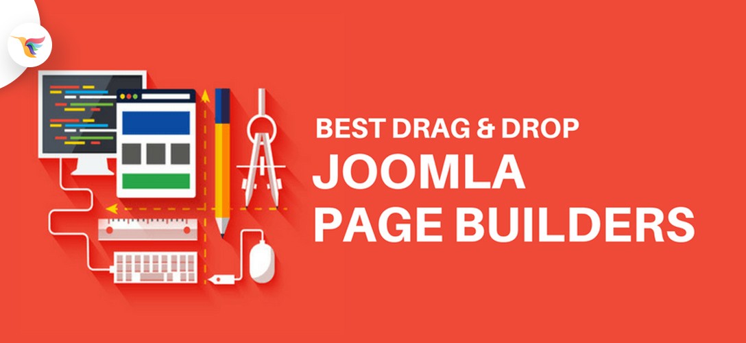
Drag & Drop Joomla Page Builders
Best Joomla Page Builders
SP Page Builder

SP page builder is one of the best page builders for Joomla. It has tons of great features to create the pages quickly with the help of drag and drop user interface. The page layouts can be exported and imported for future use which needs the same page layouts. Features like Access Control List (ACL) is used to hide/show the page elements for a predefined group of visitors.
Here are another Joomla Templates built with SP Page Builder
Medical Joomla Template
Restaurant Joomla Template
One Page Conference Joomla Template
Features of SP page builder:
- 100% responsive and mobile friendly layouts
- Simple to complex convenient row-column structure
- Copy-paste or clone page elements
- Enable or disable rows and columns or Add-ons
- Flexible undo and redo functionality to reverse the process
- Powerful media manager to organize different type of files
- Custom CSS for customization and flexible designing
- Content favoring page builder for making pages more content-rich qualified
- Compatible with JCS, K2, and J2Store
- Can add Facebook open graph data
Quix responsive page builder

If you are looking for an advanced page builder with lots of mesmerizing features and functionalities than its none other than Quix Joomla page builder. This page builder is compatible with most common Joomla framework and template seamlessly.
A huge number of clients are using Quix worldwide and they are happy. If you care for money and time than you should get along with Quix.
Let’s see what Quix page builder offers
- Drag & drop Visual Page Builder
- Quix Boost (Optimize the site performance without using any third party plugins)
- 100+ Premium Layout Blocks (Instantly complete your site with readymade layout)
- Quix Rank (Manage & Optimize SEO of your site by yourself, to boost search engine rank and traffic)
- Copy + Paste Everything
- Unsplash Integration
- Develop Complex Structures with Nested Rows/Columns
- Advanced Library to Save your custom designs, elements and use at later time.
- Visual Form Builder That Allows You to Create Form Visually.
- Joomla Articles + 3rd Party Extension Integration
- And All Other Features That Other Page Builder Offers.
Drag & Drop Element to Build Anything
Quix comes with visual drag & drop functionality, writing code for creating a page is over. Drag the element and with a little modification, you can build your desired section on your own. For your advantage, Quix offers you both classic and visual builder. Build your site in the way you want with drag & drop page building and other time-saving features like copy-paste, undo-redo, duplicate, nested rows, etc.
Quix Boost
Boost the performance of your website with Quix Boost. It will optimize entire images, JS, CSS and other scripts along with settings. Your site will run like a formula one car, and the best thing is it will not hamper the visual quality.
Quix Rank
Be the SEO expert of your site without hiring an SEO expert or any additional SEO tools. The Rank feature of Quix will handle the SEO of your site as you build a page. You will see instant results with a solution in the sidebar.
The rank feature checks the SEO with 30+ assessment checks, you will see SEO score for every page in Quix.
Readymade Templates & Block
If you are in a hurry then readymade blocks and templates are just made for you. There are more than 100+ readymade blocks and templates for every kind of niche comes with Quix. You just insert it and make ready your website.
Check out the stunning templates built with Quix Builder
- JD BizOne – One Page Joomla Template
Azura responsive page builder
The beauty of web designing is made in the name of page builders which need no coding knowledge at all. Azura responsive page builder helps to create beautiful Joomla templates with simple drag and drop tools. It not only makes it easy to build pages but also saves a lot of time that would be taken if coded by hand. The following are the full features of Azura responsive page builder.
Features of Azua responsive page builder:
- Drag and drop UI to create pages in a few minutes
- Category and tag implementation
- 35+ most used page elements for quick and easy page designing
- Support for external modules
- Awesome icon fonts
- Easy customizable and extendable
- Multi-language ready for global usage
- 100% responsive with Bootstrap 3 support
Gridbox
Gridbox is a revolutionary drag and drop website for Joomla CMS. It allows you to build modern and beautiful Joomla pages with just drag and drop tools. The powerful live code editor helps to edit the scripts and styles on the page on the go hassle-free. The following are the full features of GridBox.
Features of Gridbox:
- WYSIWYG interface makes it easier, and real-time building of pages is always fun to do.
- Full responsive drag and drop interface
- Undo and redo functionality to revoke and provoke the changes
- Responsive editor with the ability to customize everything including the backgrounds and animations
- In-built template editor
- Header layouts
- Custom backgrounds and unlimited color picking options
- Advanced typography options
- CSS3 animations
- Footer options
- One-page website builder
- Real-time code editor to edit CSS and JavaScript
RS Page Builder

RS Page Builder is meant for building better content on the Joomla pages. The colorful drag and drop interface allows users to use the elements on the responsive layout seamlessly. The following are the features of RS Page Builder for Joomla.
Features of RS Page Builder:
- Customizable layouts and elements to create stunning pages
- Support to Bootstrap 2 and 3
- Responsive layouts for better visibility on all devices
- Drag and drop interface – no coding knowledge is needed
- Recommended to use on the following versions
- Joomla 3 and above
- PHP 5 and above
- MySQL 5 and above
Page Builder CK

Page builder CK is also a content favouring page builder extension for Joomla. Page creation is easy with predefined elements in the editor. The real view option allows users to preview the page before publishing. Pages can be edited from the front end of the website with this page builder. The following are the complete features of Page Builder CK.
Features of Page Builder CK:
- Full drag and drop interface
- Real view preview before publishing the pages
- Can style columns without code
- Lightweight frontend page
- Frontend page editing
- Google font selection
- Great collection of Font Awesome icons
- Can backup up to 6 versions of the pages
- Drag and drop image upload interface
JA Builder – Build Joomla! sites in minutes

When it comes to drag and drop page builders in Joomla, JA Builder makes its own identity for its stunning features. JA Builder is a powerful tool comes with premade content sections and powerful tools that help you to customize your website and develop a stunning high-performing website. It comes with 120+ Content Blocks and 20+ ready-to-use page library.
Key Features:
- Change any text you want inline and make it look good with editor format options.
- Configure each block based on pre-defined parameters
- JA Builder supports all Joomla pages and the ability to configure layout in Joomla ways.
- You can easily combine any components in a variety of design projects. It’s easy!
- There are a lot of different blocks that will help you to make a perfect project.
- Totally responsive layout.
- JA Builder works with all Joomla template and frameworks.
- It is fully compatible with 3rd party extensions like an easy social, easy blog, k2, Virtuemart etc.
- Change image for any block by replacing URL or upload a new image
Wrapping up
Joomla is a fantastic platform to create websites and robust web applications. The adoption of the platform into the business is slowly increasing and attracting the developers to create more plugins, extensions and website builders. Hope you liked these fantastic plugins and page builders.


